Artist first, engineer second
Hi, I’m Martyna and I am an UX Designer. I’m eager to design and create for the user and always look to learn new things and explore new opportunities. My strengths are my creativity, empathy and problem-solving skills. In my designs, I combine analitical thinking with an artist’s perspective.

Skills

UX Design
Pain points, personas, user stories and journeys, problem statements are no strange terms to me.
I enjoy creating wireframes, both on paper and digital, but my favorite part is definitly prototyping and testing.
UX is such a big part of my life that not a day goes by that I don’t consciouslynotice examples of truly great/terrible UX design.

Animation and Motion Design
Thanks to my Master of Arts in Animation I pay attention to detail and know how the smallest visual change may influence the end product.
I’m advanced in After Effects and 3DS Max.
I love the psychological aspects that goes with all sorts of animations, especially the Pixar ones, and the influence it has on young minds.

Illustration
At 6 years old I was asked who I want to be when I grow up, and without a beat I answeard An artist.
These days I paint, doodle or draw baisicly everyday. I use acrylics, watercolours and – most of the time – my iPad.
Why now UX is my professional passion, illustration is till one of my great loves and favourite pastimes.
My Projects
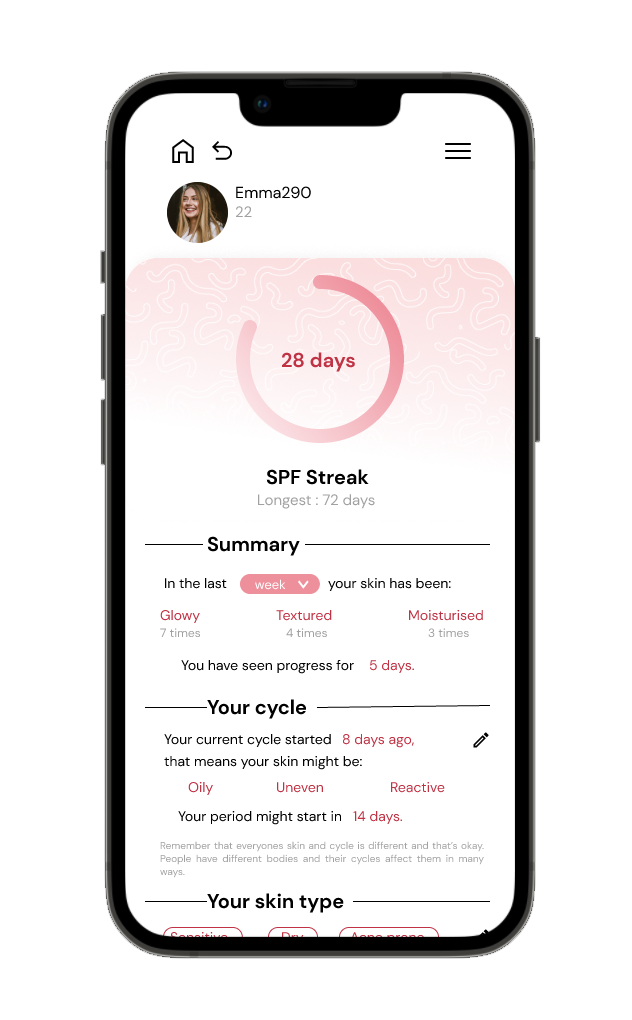
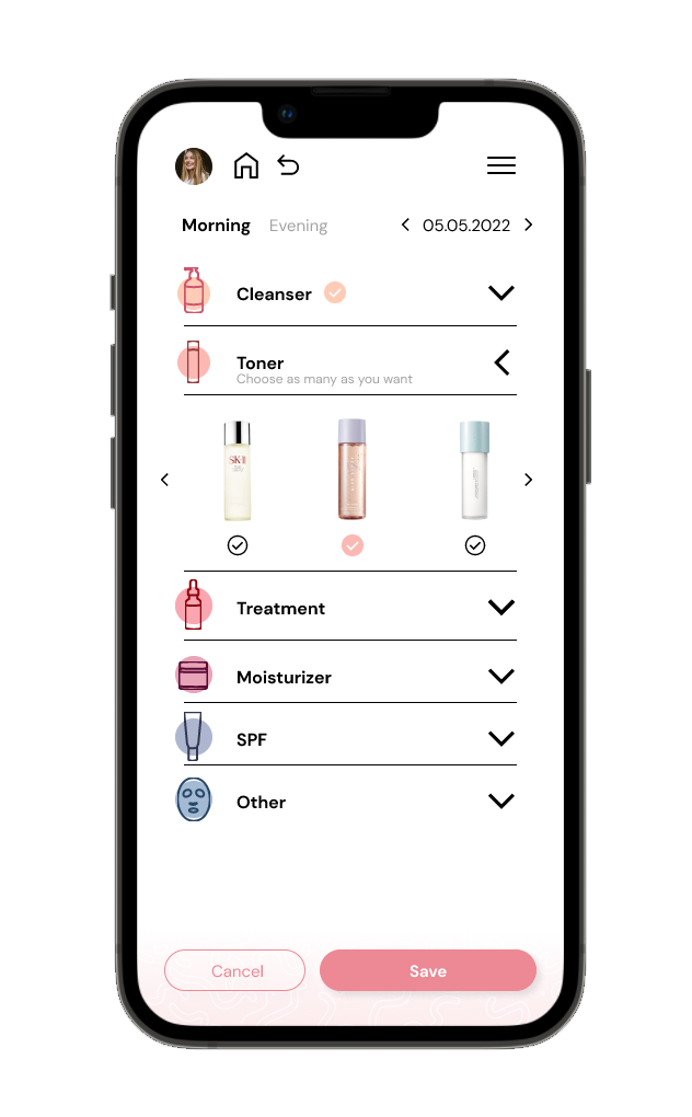
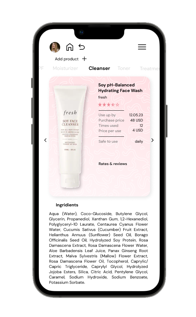
SkinCare
A mobile app for skincare enthusiasts
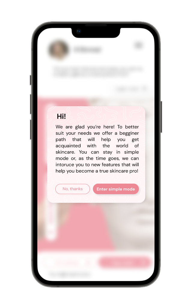
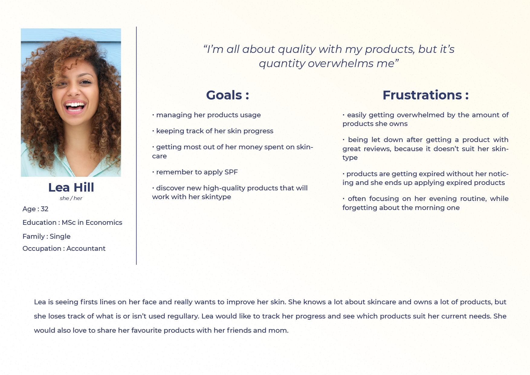
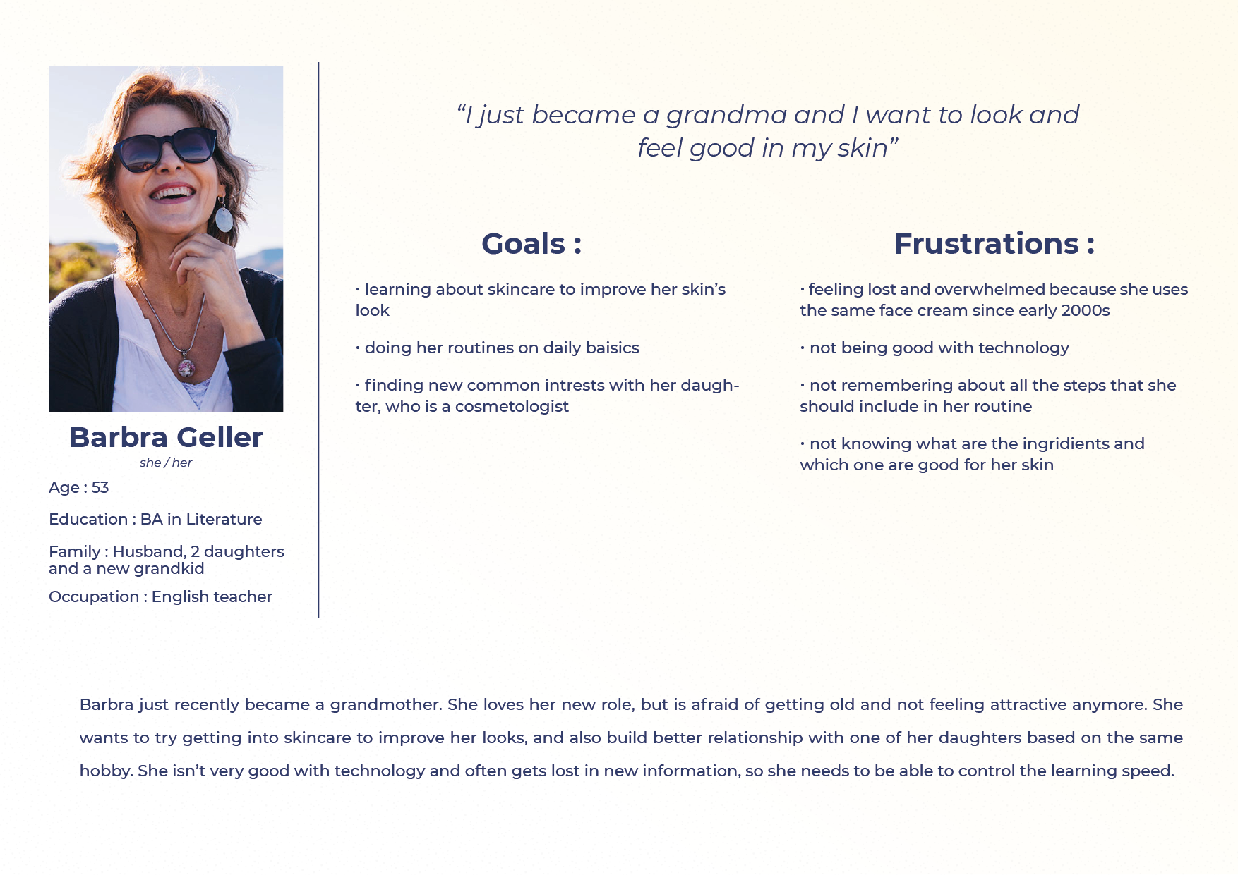
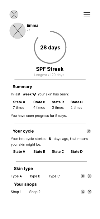
SkinCare is my own project that I would love to develop someday. It’s an app that allows users to browse skincare related products, create and manage their routines, give reviews of the products and track the progress of their skincare goals.
During my process, by creating personas and testing I came up with a simple mode – a version of app that starts with only baisic feature (tracking users’ routines), and as the time goes, introduces users to more advanced features and detailed information.
This allows users with little to no skincare knowledge to learn and build self-confidence in this matter. At any point, users can switch between modes using the settings (or profile page in simple mode, as it limits the amount of screens and complications) to fit their current needs.
In the future, I would love to further work on and eventually develop this app and introduce it to a bigger audience, because I truly believe there are communities that would both enjoy and greatly benefit from using it.


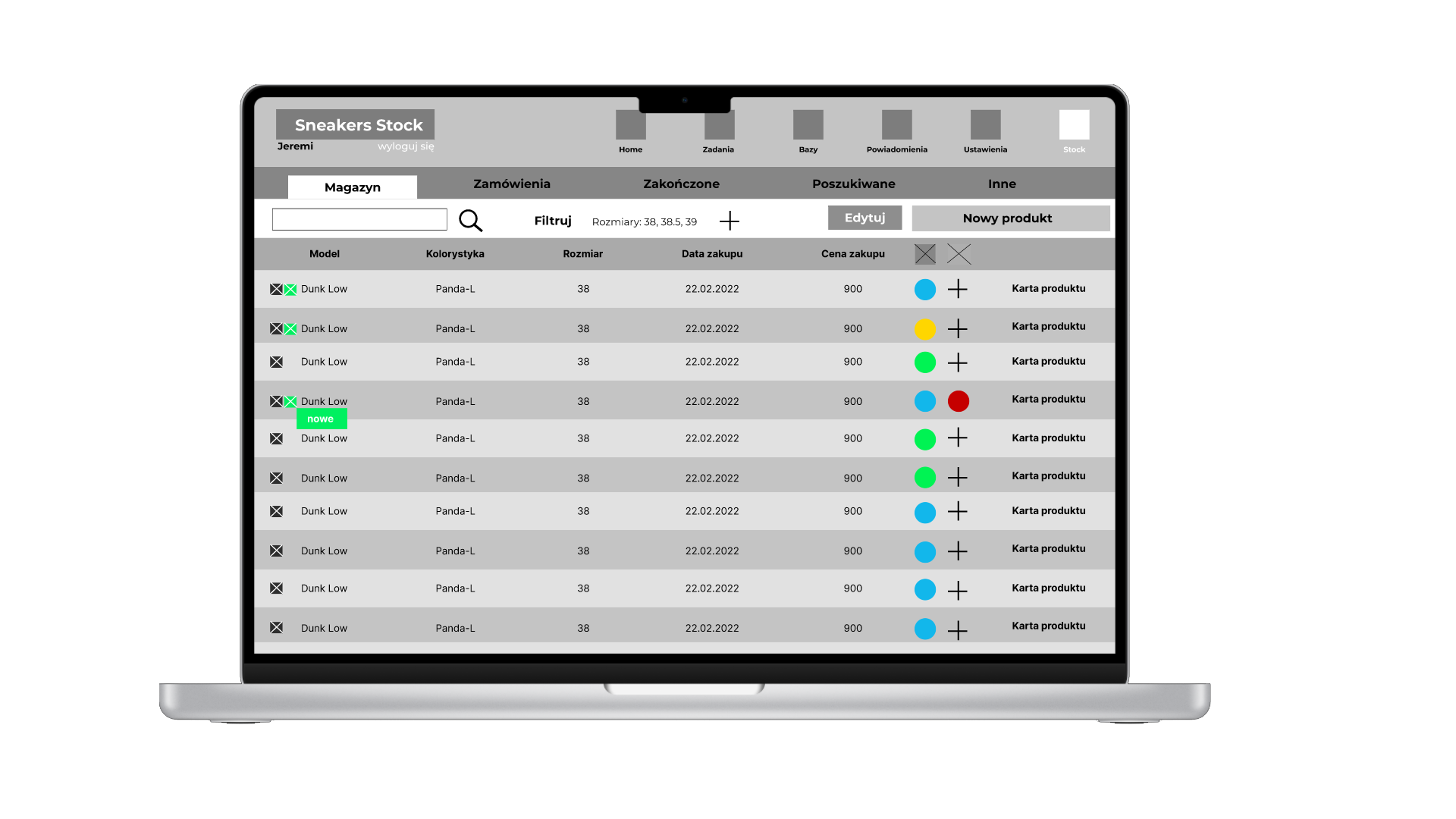
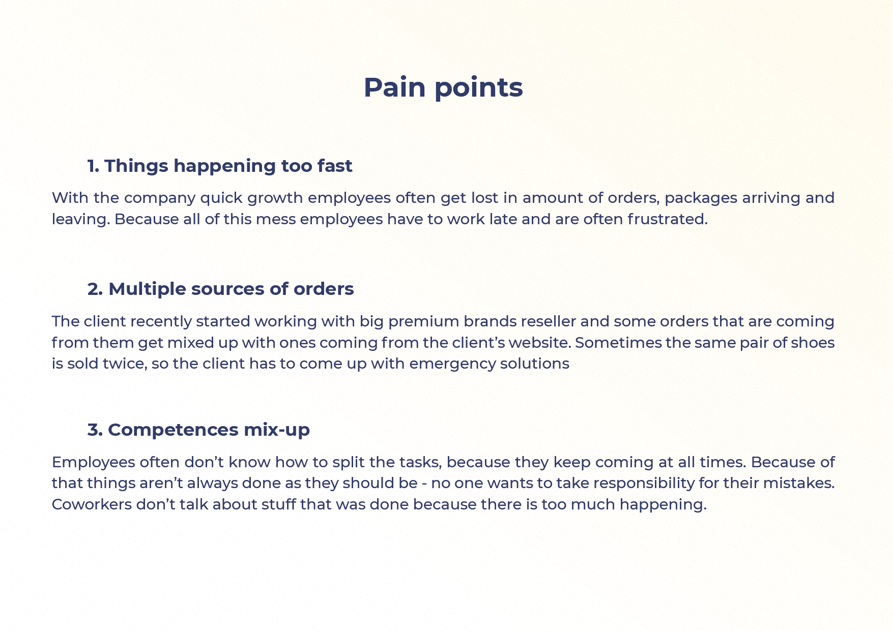
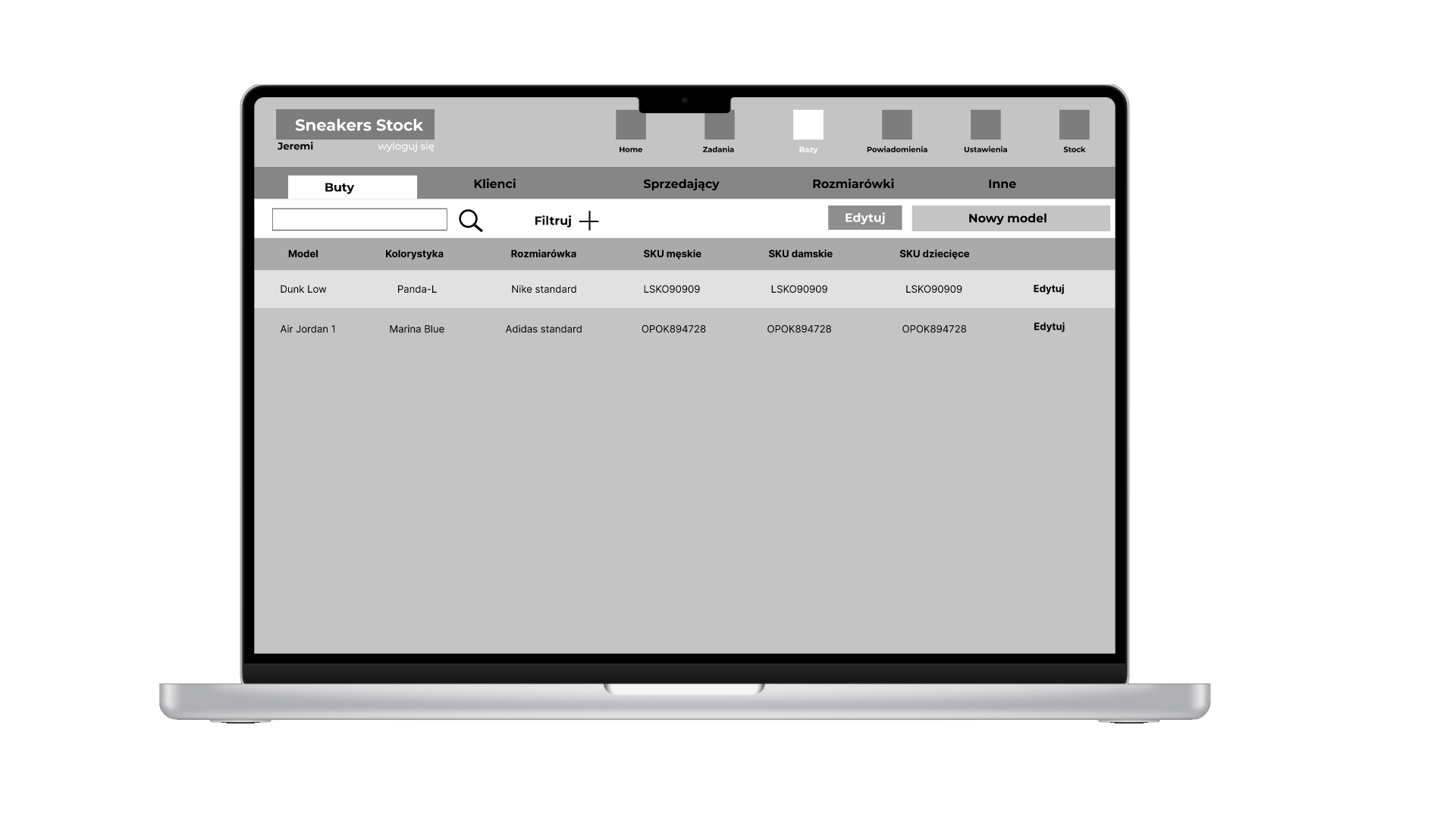
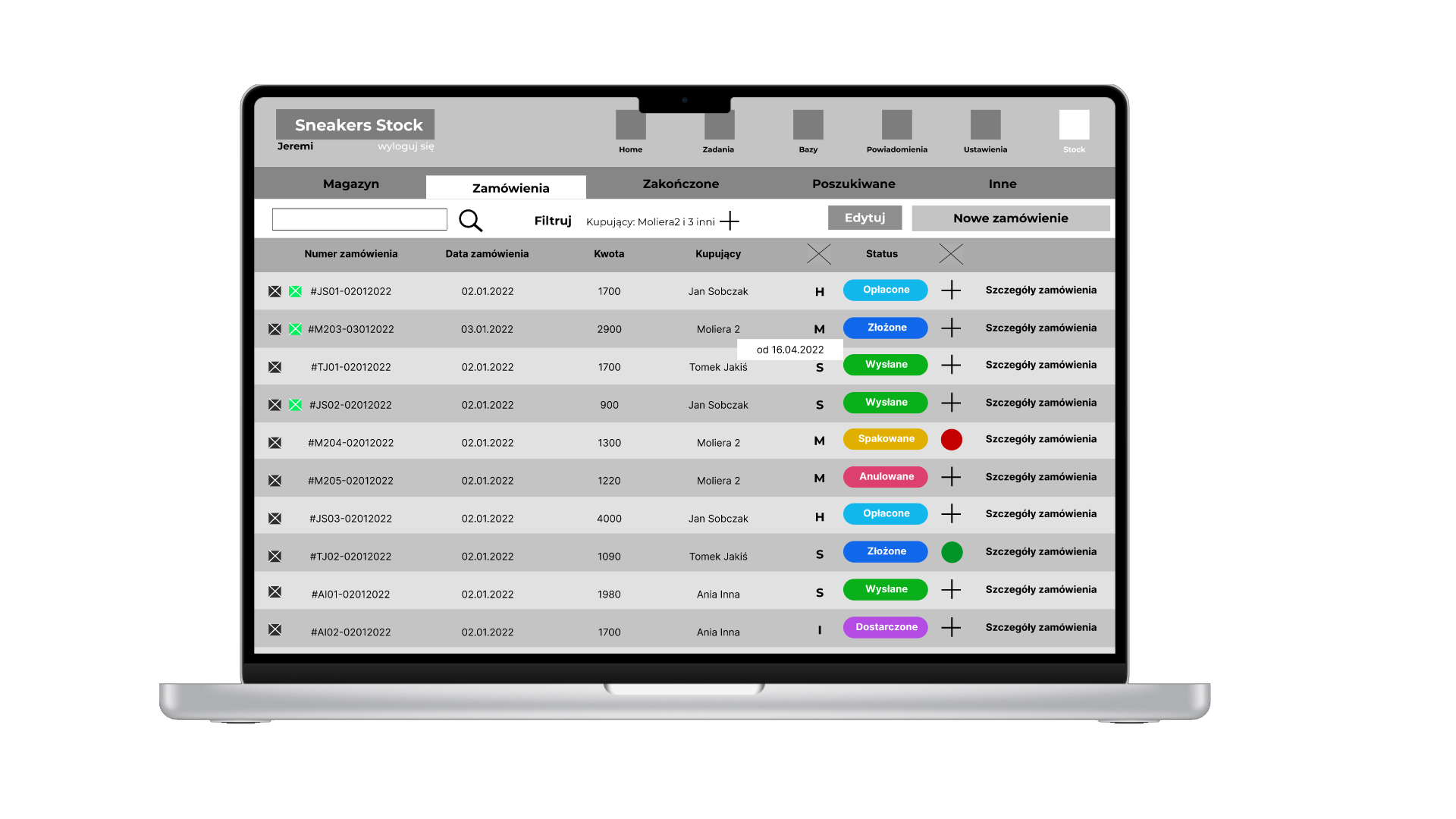
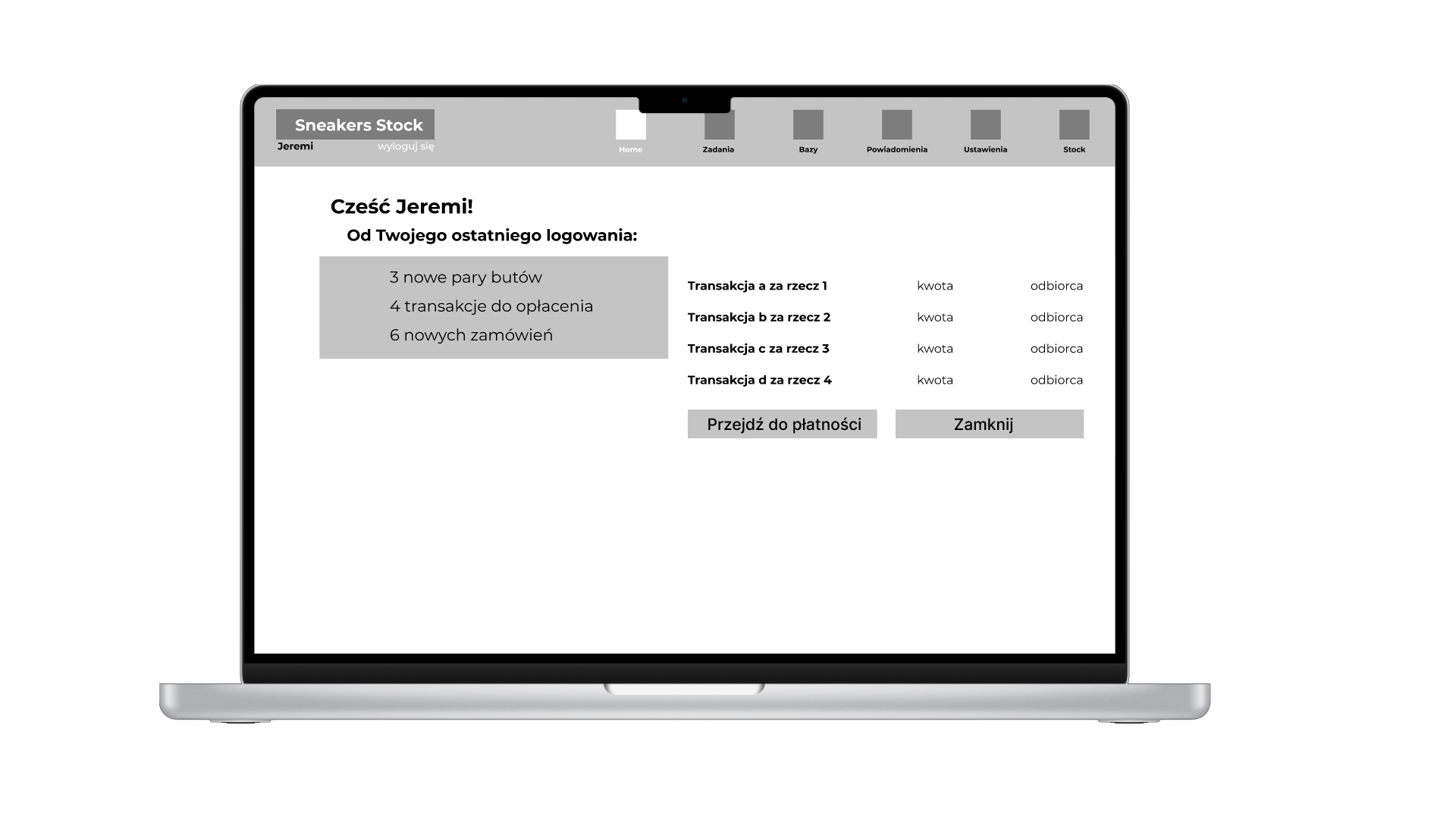
Sneakers Stock
Stock & task managing web app
Sneakers Stock is a product created for a sneakers ecommerce store. While they had an existing system that manages stock, they weren’t happy with it and thus, I was asked to devise a new system that best suited their needs.
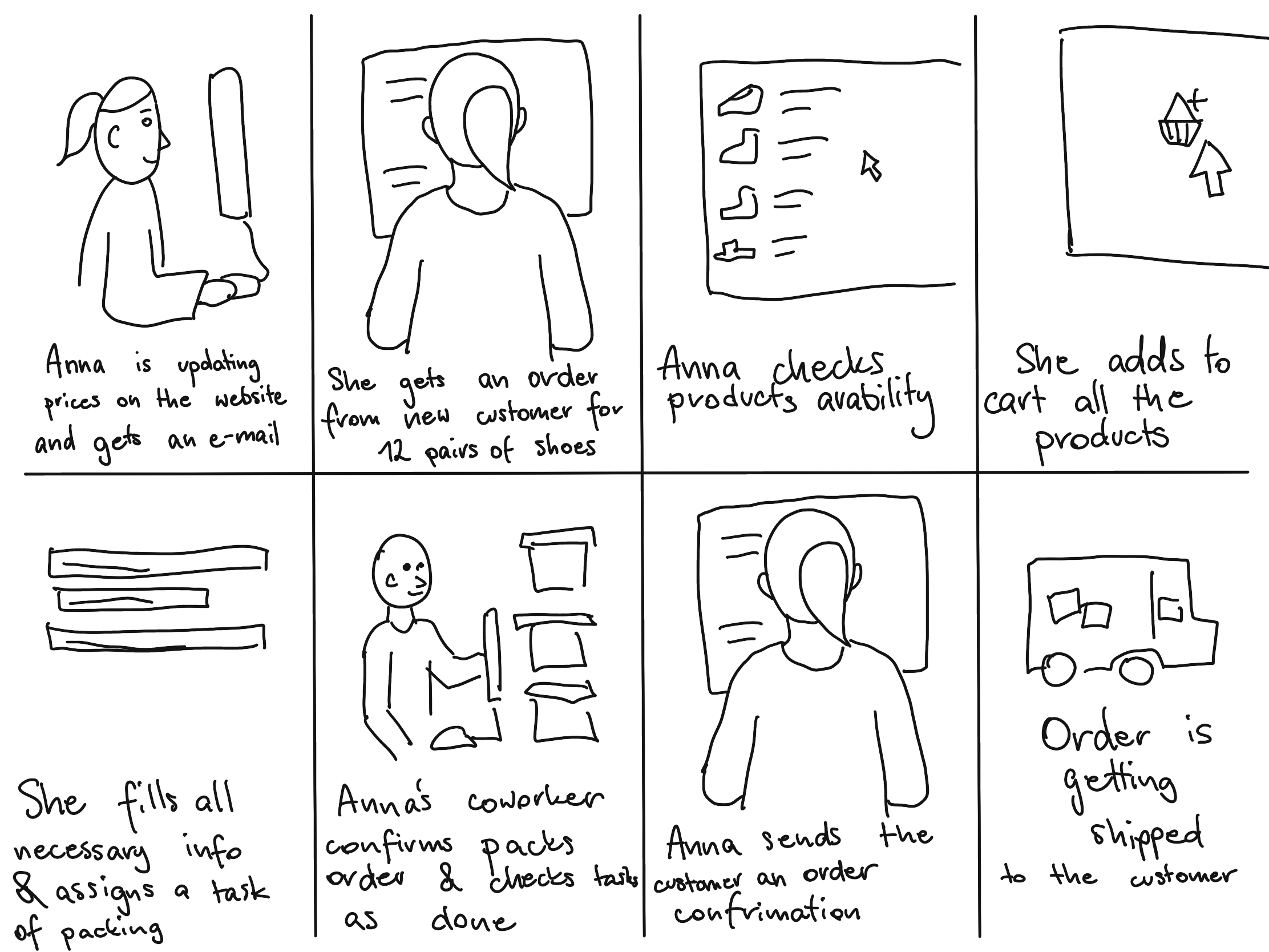
During multiple conversations with the manager and his employees, I was able to identify pain points, create personas and user journeys.
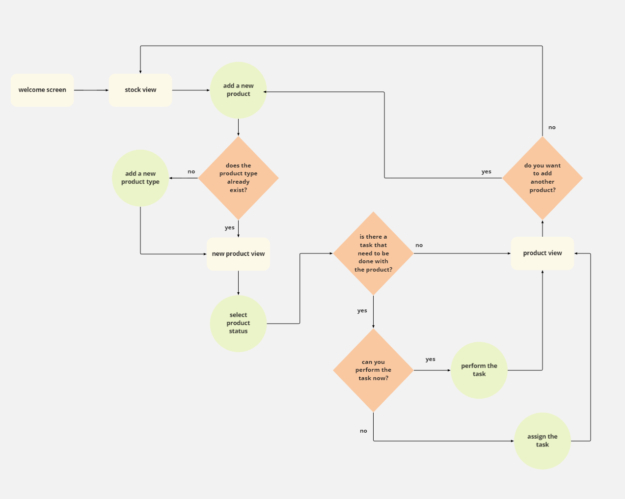
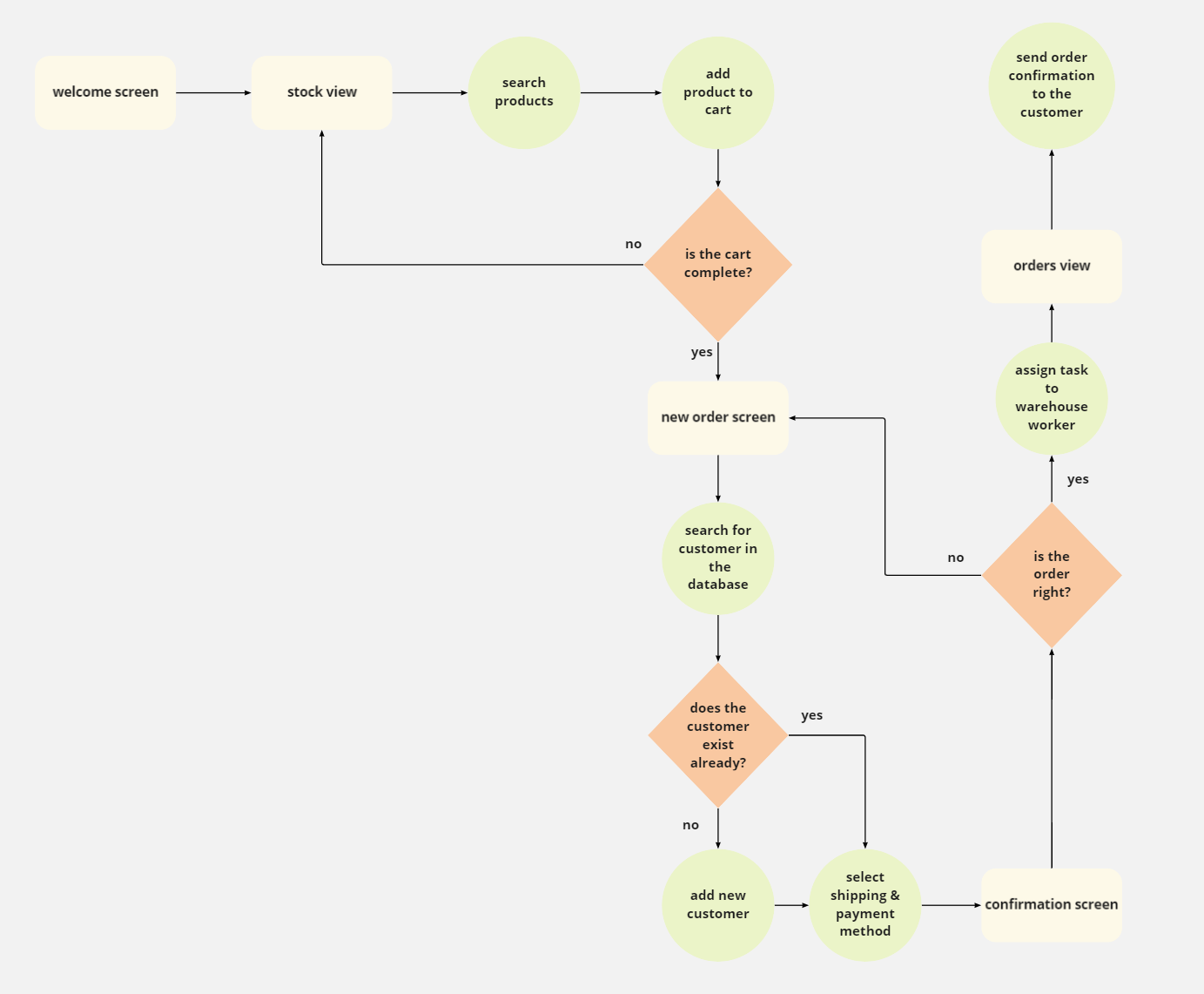
Based on that (and lots of card sorting), I came up with user flows and wireframes. Next step was a lo-fi prototype which I tested with users during a moderated usability study. The KPIs and my observations allowed me to improve the system so that it fits the users’ needs.
Now, after a final round of testing, the client is fully satisfied and the system is being implemented. It is also ready for any further future development to suit the client’s needs.
UI for now is very limited, and when the client’s budget allows it, it will be created and applied.
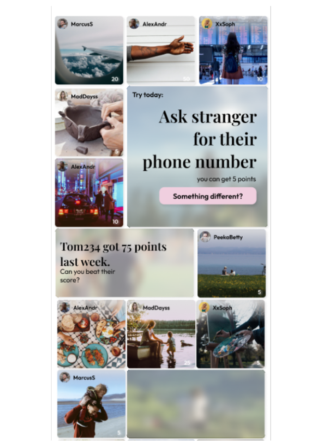
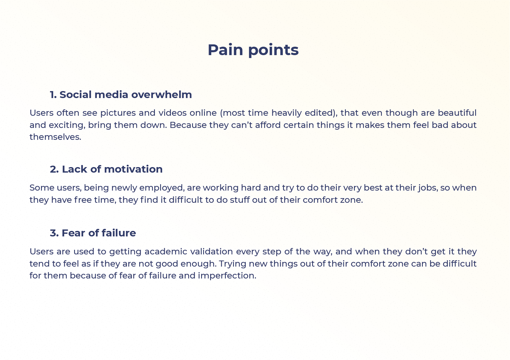
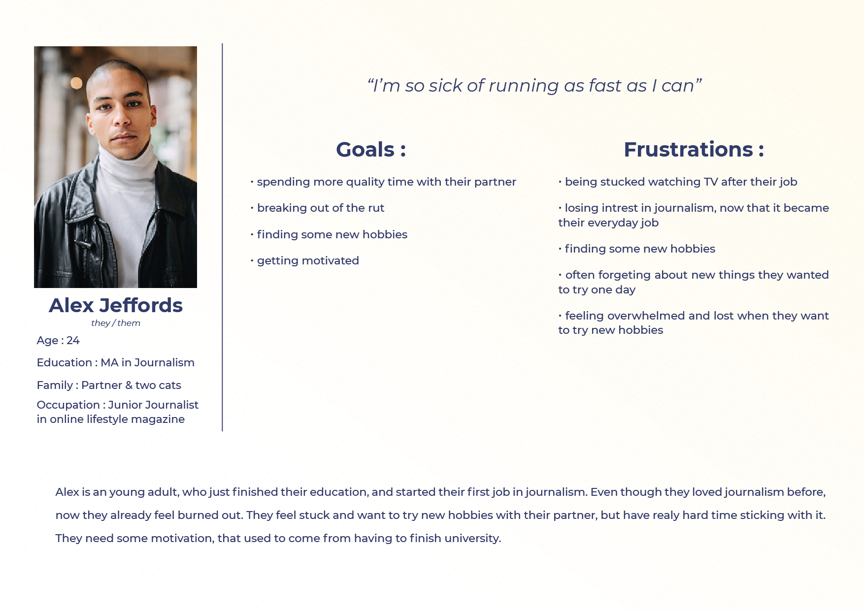
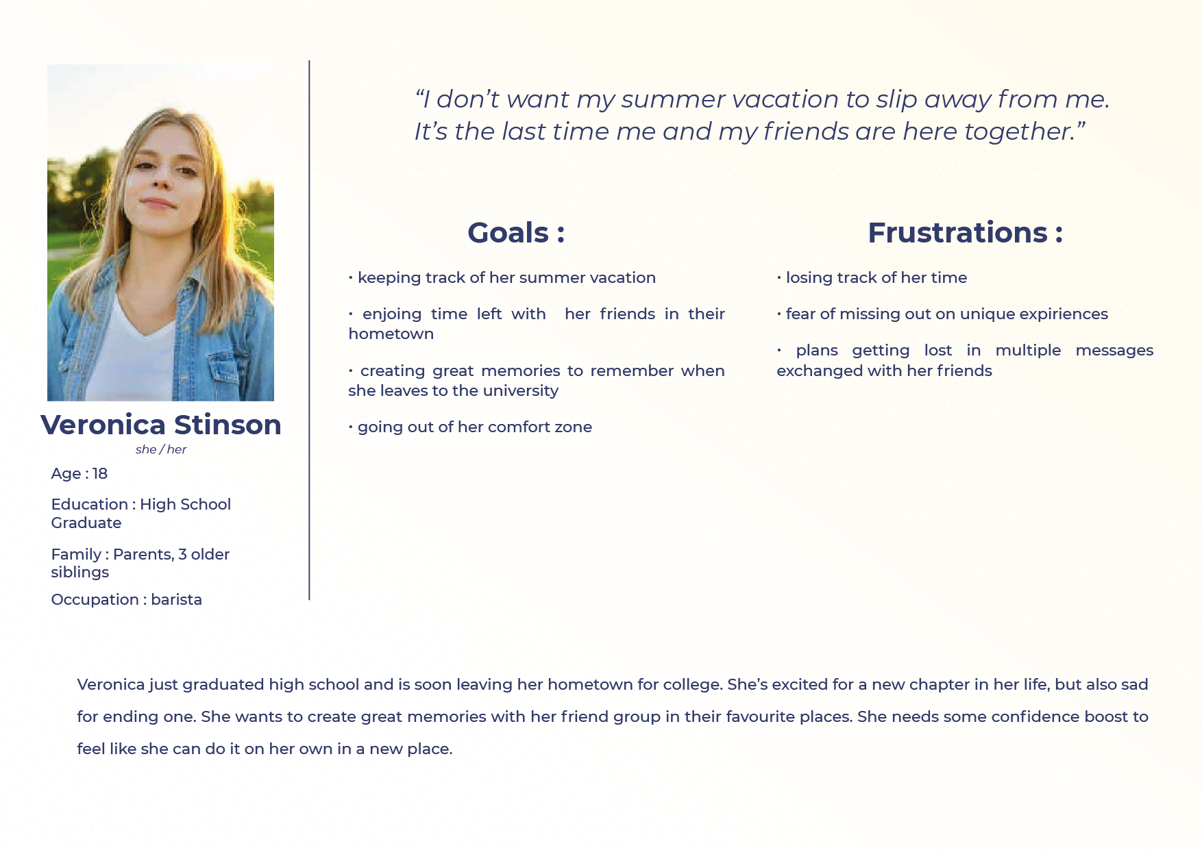
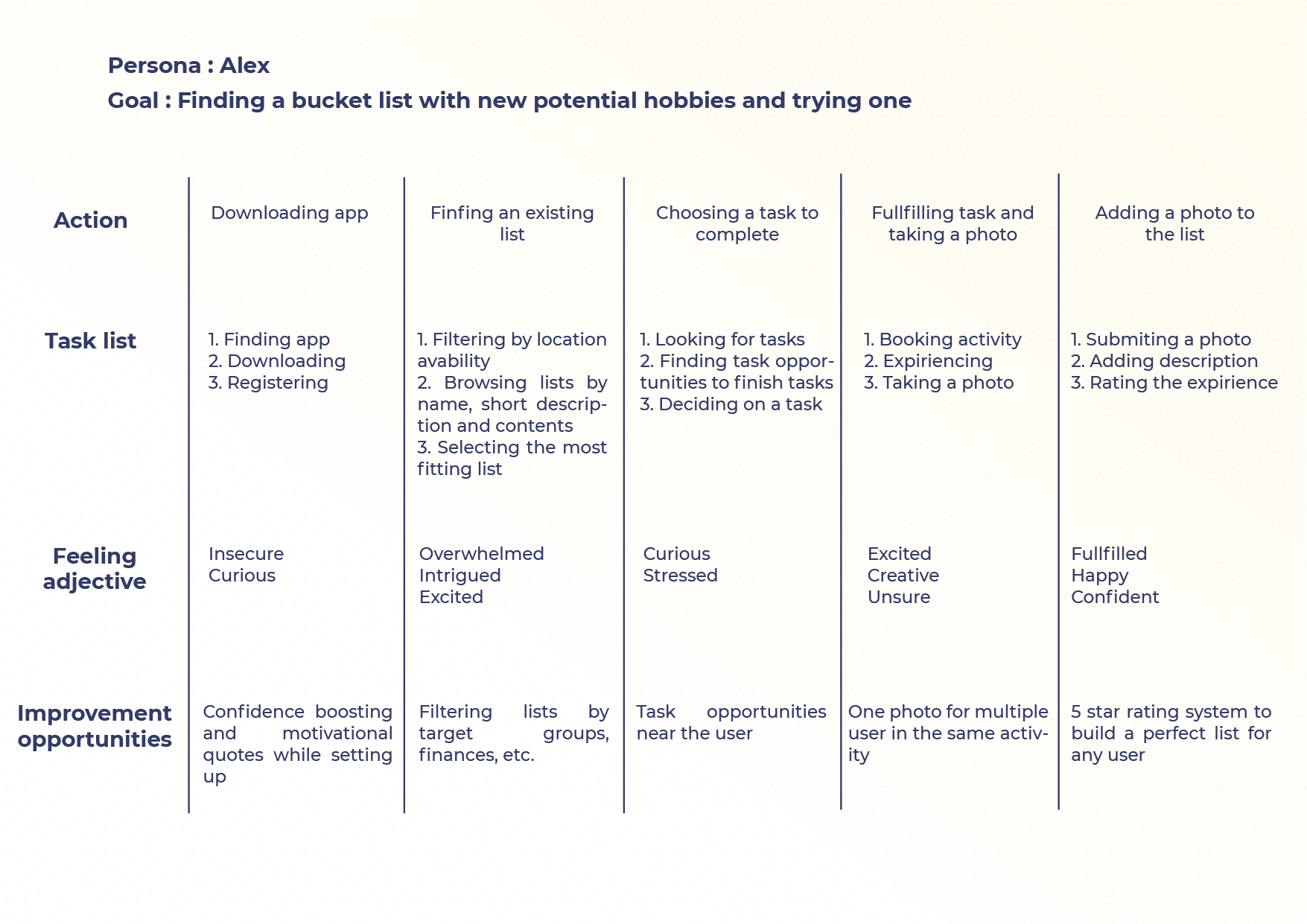
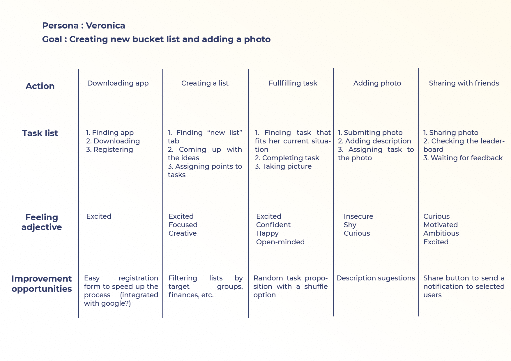
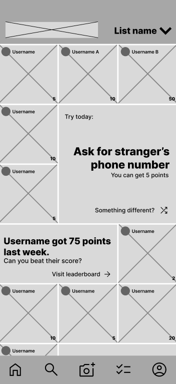
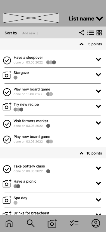
Pics or Didn’t Happen
Bucket lists to fight your fomo
Pics or Didn’t Happen is an app (or rather, soon to be an app) designed to help creating memories and having experiences easier by making interactive, photo-oriented bucket lists. The lists can be individual, created by groups of friends with common goals, or curated by the development team to give inspiration to the users.
The idea came to life one spring evening, while hanging out with my developer friends. We realised we were in a constant state of FOMO regarding the upcoming summer with all the exciting things that could happen and no specific plans being made.
The core idea is, each list item is only completed when a photo of the event has been submitted. The user gets a predefined number of points, which then appear on the leaderboard, giving all other users motivation and inspiration to try and explore new experiences or challenges.
As a team we did some research, and based on that, we came up with core features, which then I further explored by creating personas, crazy eights and user journeys.
Now, the app is in early stages of development based on the lo-fi prototype that I created (and tested with some potential users).
Hopefully, in the near future I will be able to create a simple UI for the app and showcase the finished product, ready to be enjoyed by all kinds of users.

My way to UX design – a little backstory
TL;DR I have a broad background and I find UX design really fun.
Ever since I was little, I have always been the creative type. At school, everybody looked to me to help them solve their problems. Whether it was a maths class, or a big event that had to be organised, I was the one to ask for help. This sometimes had downsides, as I fell into an unhealthy pattern of doing things for others, regardless of whether I had the time or not.
While getting my bachelor’s degree in Computer Science, I was the only girl in the group. As such, I was expected to work thrice as hard just to be taken seriously. However, I proved myself not by choosing to outwork others but to outthink them. By employing my creativity and the ability to look at things differently, most of the time I was able to come out on top. Whenever my ideas made it through the glass ceiling, I found myself enjoying taking leadership in projects instead of only being the shy mastermind behind them.
Whereas my mind always loved the challenges I found in mathematics, my heart kept leaning towards the artistic side. Hence, I chose the Academy of Fine Arts for my masters, specifically a course in Animation. This allowed me to view both myself and my skills from a whole new perspective. I learned to be bolder with my ideas and their presentation, so as not to become a former programmer getting lost in a sea of experienced artists.
I found UX design to be the most fulfilling profession for me – finding solutions that are useful, intuitive and include many different user groups allows me to have a creative outlet, while still analyzing data and behaviors. I enjoy the process of gathering information, discussing different points of view, stepping into other people’s shoes, designing, testing (and then rinsing and repeating), to create a polished and useful final product.
Contact Info